Saturday 14 February 2015

Premiere Vision Spring/Summer 2016


As always I approached Premiere Vision with pent up excitement. I always find learning about upcoming trends extremely insightful, particularly when i have the opportunity to learn how they came into fruition.

Unfortunately I missed the Autumn/Winter 16/17 WGSN trend presentation due to being unable to locate the room. By the time my colleague and I had found the venue the doors had been closed which, as can be imagined, was a huge source of frustration for me.On the plus side, WGSN is so well organised that it uploads the same trends onto it's website within a few weeks of the event.


One of the parts of PV I was most excited for this year was the press club. This year is the first where I have been emailed a free press pass which enables me to take photographs without being frog marched into a corner and forced to delete the images. This has been a great way of refreshing my mind about the trends- it's always great to have a prompt to jog your memory. As you can see I have still made my usual trend response boards, but I have also been able to include photos of how the PV trend area was laid out.

The Premiere Vision trend area and Indigo.

Photos of the fabrics shown in the Premiere Vision trend area.

There were 17 trends for Spring/Summer 16 , titled as follows:
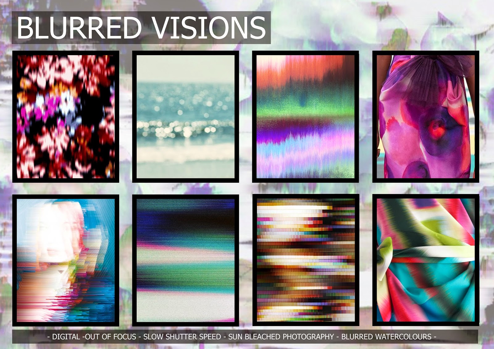
contrasting, blurry visions, automatic writing, freehand sketches, ethnic markings, milky blossoms, sketchy, sweets, animal chatter, little jokes,hatching,large geometrics, apache geometry,interlocked geometrics, comic book style, teeming flowers, in the bush. 

I have decided to merge some of these trends into one to create a smaller pack of 10 trends:
comic book florals, apache geometry, foliage(in the bush), ethnic markings, automatic writing and hatching, freehand sketches, milky blossoms, 80's floral(contrasting), conversationals, blurred visions.

From what I saw at PV, the majority of print trends(excluding the digital ones)have a strong freehand, handcrafted feel to them. Gaining immense popularity on the runway in recent seasons with prolific designers like Diane Von Furstenberg, Burberry and Antonio Marras jumping on board, it is unsurprising that we are now seeing a vast array of hand drawn/illustrative/painterly prints.


This girl can.....

Around September last year I created this piece of artwork..


Although not a particularly breathtaking piece of art, this quote from author R.S. Grey quickly became my motto. I am of the firm belief that you can achieve anything you set your mind to.

Towards the end of last year I became more aware of my increasing unhappiness in London, brought on by nothing in particular and everything in general. Common sense dictates that if you aren't happy with you life then you should change it. So that's what I sought out to do. One of/the only perk to not having a boyfriend is that I'm not restricted when considering possible job locations- I have no one else to consider in my decision making....selfish but true. In the spirit of this I applied for jobs in Denmark, Sweden, Germany, America, Australia- I was open to anything! I went to secret interviews on my days off work in a desperate attempt to satisfy my need for change(hence the lack of blogging). 2 months later and no news from the interviews. I gave up. I went for a freelance interview and decided I would move back to the North and freelance until I had found some balance in my life. 

Apparently this was against some divine plan as 4 days after making this decision I received a phone call to say I had been offered the job in Germany!!!! So... on the 10th March I will be uprooting my life for the second time and moving to Dusseldorf to be Print designer for girlswear  at C&A's Clockhouse brand. I AM SO EXCITED!!!! I speak no German and have never worked in childrenswear. This is such a challenging opportunity and I cannot wait. 


Anyway...I wanted to focus this blog post on the new Sport England 'This Girl Can' campaign and the increase we are seeing in motivating and empowering women particularly through social media. Which I guess ties in to the piece of artwork at the beginning of this post. 

'I jiggle, therefore I am' sounds about right for me :)

" This Girl Can is a national campaign developed by Sport England and a wide range of partnership organisations. It's a celebration of active women up and down the country who are doing their thing no matter how well they do it, how they look or even how red their face gets." (taken from the campaign website) 

The campaign challenges the way the media has portrayed women over the years. It avoids airbrushed images and shows women as they are regardless of sweat dripping and fat jiggling. Finally a realistic and empowering image of women, one that we can actually relate to.


Back in September last year Emma Watson became the face of the #HeforShe campaign which brought the issue of gender discrimination to the forefront of the worlds attention. For so many years feminism has been associated with a negative stereotype, the heforshe campaign not only encourages women to be feminist, but also encourages men to speak on the behalf of women. 

We seem to be experiencing a new wave of feminism, far removed from the days of fighting for women's suffrage. Over the recent years we have seen an increase in positive feminism- women standing up for their rights; for their education; for their freedom of speech. I have recently been reading 'I am Malala', an amazing account of how a young girl, Malala Yousafzai, made a stand for educating women in Afghanistan. Definitely worth a read if you haven't already.


With the mass kidnapping of 300 schoolgirls by Nigeria's Boko Haram in April last year and a resurgence of India's rape crisis in the headlines after the Badaun gang rape/murder, crimes against women constantly appeared in the headlines of 2014. It seems that, as a reaction to this, 2015 is a year of action; a year of motivating and empowering women; a year of encouraging feminism.  

Recently I saw the below poster for the design museum in a tube station. I could not love this more. It is so relevant to the industry I work in and I will be making sure I see the exhibition before I move to Germany.


So....2015 A year of female empowerment.. a year where this girl can, and she will!


Friday 6 February 2015

Pre-fall 2015 Print trends

At long last I have finally finished the Pre-fall 2015 print trend boards. Just in time for Premiere Vision and the Fall 2015/2016 collections to come out next week.

The boards below show the trends I have picked up on through the Pre-fall collections. If you think I have missed any please let me know as it's always interesting to see what other people pick up on too! 


Houndstooth appears to be rearing it's head once again but in a much more contemporary way with oversized houndstooth motifs rearranged to look less harsh. Versace has absolutely dominated this trend with houndstooth motifs taking over the entire collection.


I am basically in love with this new take on geometrics. I've really enjoyed watching this trend develop from the A/W14 Prada show and the recent trend for Matisse style cutouts to this 70's infused trend of juxtaposing geometrics. My favourite collection for this trend is without a doubt the MSGM range where colourful shapes have been layered on top of each other to create a robotic print.


It has been creeping in to collections for a while now but Pre-fall 2015 saw designers make a unanimous move towards 70's styling, colour schemes and prints. Bell bottom sleeves, flares, turtle necks and boho maxi dresses were all popular shapes and layering seems to be key for this trend. With Barbara Hulanicki(founder of 70's powerhouse label Biba)returning to create a capsule collection for Biba after 39 years it is obvious that the 70's is making a huge comeback. No doubt this will continue as the dominant theme for the Autumn/Winter 2015 collections. But what next...the 80's maybe?I guess I'll find out at Premiere Vision next week!


    Naive, simple florals in bold flat blocks of colour have begun to be the trademark print for this 70's trend. Art nouveau florals are also emerging, reminiscent of the Biba prints of the 1970's. 


Another trend I love is the folk floral trend. Dark bases with bright delicate florals seemed to be present in so many of the Pre-fall collections. My favourites are the prints from the Alice+Olivia, Thakoon and A.L.C collections which are reminiscent of the dot work florals from Valentino's S/S15 collection. 


 The newcomer: Persian rug patterns......This was a predicted trend in my Premiere Vision report back  in September and I'm quite excited to see it starting to work it's way into the runway collections. Taking inspiration from tapestries and Persian rug motifs works best with deep,rich colours. I have combined this trend with paisley prints as I feel they sit together nicely to create a new ethnic trend. Definitely a trend to watch out for in the Fall 2015 collections.


So those are my trend boards for the Pre-fall 2015 collections. Next week is Premiere Vision and I have been lucky enough to have been sent a free press pass from the event organisers. Hopefully I will be posting a dazzling new set of PV trend boards next week with upcoming trends including photos from the event. :)